Concept means a great deal to me when executing any creative effort, and with that comes a reliance on planning and structure. However, I can admit that spontaneity has its merits, and for that reason I chose to shoot my latest project without any premeditation. I took advantage of a weekend trip to Philadelphia, a place I had never visited, by using the foreign terrain as a workspace for a project with no formal guidelines. Instead of clinging to an idea, I played the part of the tourist, snapping pictures of things that caught my eye. The results of the trip were intriguing because they yielded a consistency that I was entirely unconscious of while shooting. I tended to draw my attention to the loneliness present in populated spaces, more specifically on and around the local SEPTA trains.
Train stations are little more than a place of transition: hundreds of people--commuters, travelers, students--convene in one of several locales around the city for a few minutes at a time as they wait for a connecting ride to anywhere else. This connection is what interests me in retrospect; the fact that most people do not want to be at, say, a train station, but they rely on it to get somewhere more desirable. Thus, an abundance of images depicting empty stations and solo passengers seemed to stand out on the contact sheets, reminding me that I myself was in transition during my stay in Philadelphia.
The project was a good experiment for me, allowing me to free myself of formalities and take a more street photography approach to my images. It also reaffirmed my interests in narrative photography with strong conceptual foundations. In a way, spontaneity inspired me to think of future projects rooted in pre-production and technical precision--these images reflect a creative transition, and ultimately brought inspiration for stronger pieces.
Friday, May 6, 2011
Sunday, April 17, 2011
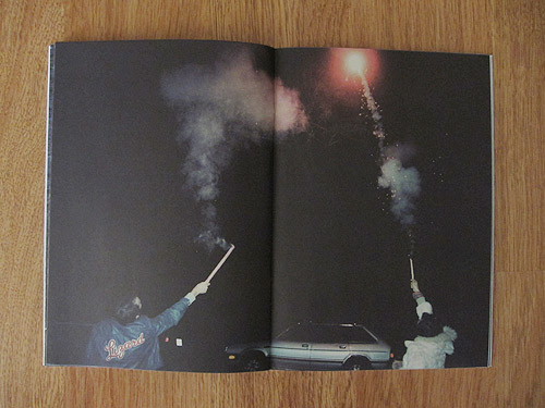
Final Project Images
Here are a few rough scans of negatives that I've chosen to print for my final project:


Monday, April 11, 2011
Booooooom!
I don't browse online photo zines as much as I know I should, but lately I've been enjoying the photo section of a creative arts blog called Booooooom! Here's a link: http://www.booooooom.com/sorted/photo/
My friend brought the site to my attention a few months back when he emailed me this blog entry about a young photographer named Jeff Luker. He had put out a small photo zine in November called "Not Many Kingdoms Left" that I really enjoyed. Here's a link to the article, which also links to Jeff Luker's personal site.
This photo blog keeps me coming coming back because it offers such a diverse catalog of work from various artists, from more fine art photographer to fashion and even to the narrative street/documentary work of Luker. The site is always looking for submissions from new photographers, so I plan to enter some of my work in the near future. Happy browsing!
Thursday, April 7, 2011
Photography from the New China
I wasn't sure what to expect form the "New China" photography exhibit at the Getty on Tuesday, but the showcase ended up being very intriguing. My favorite of the the selected photographers was

Overall the exhibit was informative and exciting. Certain artists like Rong Rong were showcasing work that documented the Beijing East Village, an art collective that struck me as extremely independent and self-sufficient given its restrictive environment. I can admit (unfortunately) that I am one of many Westerners who have little to no intellectual investment in the Eastern art world, but after seeing these photographers I have been inspired to look to the cultural and artistic movements of Asian countries to find new ideas. The radical differences in how the Far East operates culturally influences the modes of creative production amongst the artists over there, and I know I could benefit by studying them.
Wednesday, March 9, 2011
Spring Break
Two things happened during my spring break:
1) Very little.
2) My car died.
I made good use of my bike in the past two weeks, and we're becoming close friends now considering I won't have a car to deal with for a while. Aside from the obvious financial and health benefits, riding around town has given me an opportunity to take in the surroundings a little more than I normally would. Lines, shapes and patterns stood out to me for some reason, so I decided to document them.
https://picasaweb.google.com/Hamsuite/PHONE?authkey=Gv1sRgCLLD0u2esteuFg#
Monday, February 21, 2011
Final Project Proposal
When it comes to my preferences in photography, I tend to lean towards the staged narrative over documentary or street photography. Gregory Crewdson has always been a huge inspiration because the elaborate production value and intriguing use of tableaux create a very polished, cinematic image. However, lately I’ve seen my interests gravitate towards photographs that are less polished.
 |
| Example of a typical Gregory Crewdson setup. |
Photographers like Weegee, Bruce Davidson and Helen Levitt have been grabbing me because their pictures seem to weave a narrative thread into the sporadic, unplanned environments that they shoot in. Their photos achieve a similar narrative construct to Crewdson, but their execution and the aesthetics of their work are much more flawed and, consequently, more real.
 |
| Bruce Davidson |
 | ||
| Bruce Davidson |
 |
| Weegee |
 | ||
| Weegee |
 |
| Helen Levitt |
For my final project, I'd like to shoot a series of photographs that works as a loose, cinematic narrative without the rigid structure or staged tableaux of, say, a Gregory Crewdson photo. I come from a film studies background, so the easiest analogy I can draw from the cinema to illustrate my intentions is the French New Wave movement of the early 60's. Directors like Truffaut and Godard were taking their films away from the sterile, artificial sets on film stages and into the streets of Paris, using real locations and people to tell their stories. The result was a raw, crude picture of Paris in the 1960s whose flaws added a layer of truth and beauty to the films produced during this time.
While I'm not entirely sure what I want to focus on with this series of photos, I know that I want to achieve something similar to these New Wave films: the impromptu, documentary style of shooting combined with a cinematic narrative structure--utilizing my surroundings as they exist instead of manipulating or staging the pictures.
I plan to shoot 35mm color negative, because its low cost and the portability of an SLR camera will allow me to shoot more footage in less time than if I shot 4x5 or even 120 film. I'd like to print traditionally in the darkroom, blowing up the prints to at least 11x14 size but potentially 16x20 depending on how noticeably the image quality degrades. I like the grain structure that 35 produces when blown up and I think conceptually it suits the project.
I plan to shoot 35mm color negative, because its low cost and the portability of an SLR camera will allow me to shoot more footage in less time than if I shot 4x5 or even 120 film. I'd like to print traditionally in the darkroom, blowing up the prints to at least 11x14 size but potentially 16x20 depending on how noticeably the image quality degrades. I like the grain structure that 35 produces when blown up and I think conceptually it suits the project.
The slide photo assignment had me thinking about photography as a nostalgic device, and I might choose to focus the attention of this project along similar lines. I enjoyed using the slide projector, so I might incorporate a slide show into the project alongside the prints I make.
It's apparent that the idea I have is abstract in its current form, but I hope to start shooting immediately and formulate a more structured statement as time goes on.
It's apparent that the idea I have is abstract in its current form, but I hope to start shooting immediately and formulate a more structured statement as time goes on.
Sunday, February 20, 2011
Color Temperature
Forgive the poor quality of these images--lack of a DSLR has left me with a cell phone camera, but I think the images still get the point across.


Manchester Avenue at 11:00 AM

Manchester Avenue at 4:00 PM

Manchester Avenue at 6:30 PM
And here is an example of lighting with mixed color temperature:

Thursday, February 17, 2011


Tuesday, January 25, 2011
Visual Research: Alec Soth
After attending the Research for Visual Inspiration seminar at the library earlier today, I had a chance to browse the oversize section for photography monographs. Among the many books I stumbled upon was Alec Soth's Sleeping by the Mississippi. Though I had seen a few of the photos in this monograph before, I never had an opportunity to see the entire series in print like this (nor did I know that Hannon Library carried so many monographs).

I was drawn to Alec Soth's work in particular today for two reasons. The first is his use of color in the pictures he takes. There is an overall sense of muted color tones in Mississippi, an effect that is clearly owed, in part, to the cold, overcast environments that he was shooting in. When striking colors are seen in his images, they have a purpose and separate the subject from its background (as in the above photograph).


I was drawn to Alec Soth's work in particular today for two reasons. The first is his use of color in the pictures he takes. There is an overall sense of muted color tones in Mississippi, an effect that is clearly owed, in part, to the cold, overcast environments that he was shooting in. When striking colors are seen in his images, they have a purpose and separate the subject from its background (as in the above photograph).
The second appealing aspect of Alec Soth's work that I respond to is his use of large format photography. The resolution, extra focal control, and shallower depth of field that large format photography allows creates a unique type of image that can't be replicated by 35mm film. I had an opportunity last semester to work with 4x5 photography and I really enjoyed the process. Despite the added cost that comes with shooting 4x5 color negative, Soth's work makes me want to commit to large format for my final project.
Wednesday, January 19, 2011
Lauren Marsolier

Yesterday at Bergamot Station I got a chance to see Lauren Marsolier's photography exhibit, "Transition." Lauren shot photos in cities and near major freeways and roads and digitally removed key components of each frame, transforming the images into desolate landscapes with very subtle tonal patterns. I liked the above picture in particular because of its balance achieved through both color and composition. The two converging freeway overpasses direct the eyes down the center of the image nicely, and their slightly curved edges make for a less rigid manipulation of perspective than, say, shooting down the middle of a street. Color, though scarce, is well thought out. The blue of the sky works well with the small yellow sign because the two are complimentary colors, and through her alteration of the image Marsolier creates a subconscious sense of symmetry in the shot.
Monday, January 17, 2011
Eggleston

I'm surprised I hadn't heard of William Eggleston before this exhibit popped up, but the images I saw were definitely familiar. My appreciation for older color photographs is so high that it nearly turns into envy, and Eggleston's work didn't fail to impress me. The compositions and subjects of so many of his photographs seem as arbitrary as those a kid might take if he got a hold of his parents' camera, but the color really draws your attention. The above shot wouldn't be effective in black and white because the colors add to the balance of the frame. My envy grows when I see a picture like this because this is the kind of color I'd like to see in my own work--varied and well placed but slightly muted in tonality--the kind that seems like it could only come from a different time period. The yellow in this photo is so striking, but it isn't too loud or distracting; and the blue and red in the frame create a spectral symmetry that, despite a seemingly uninteresting composition, adds a new dimension to the shot. If I could achieve something in the same vein as this sort of color in my own photos I'd be extremely happy.
Subscribe to:
Posts (Atom)